
Why PS2-Era Menus Were Somehow Cooler
Game interfaces used to sound, move and behave like they belonged to the machine. Then usability won—and some personality disappeared with it.

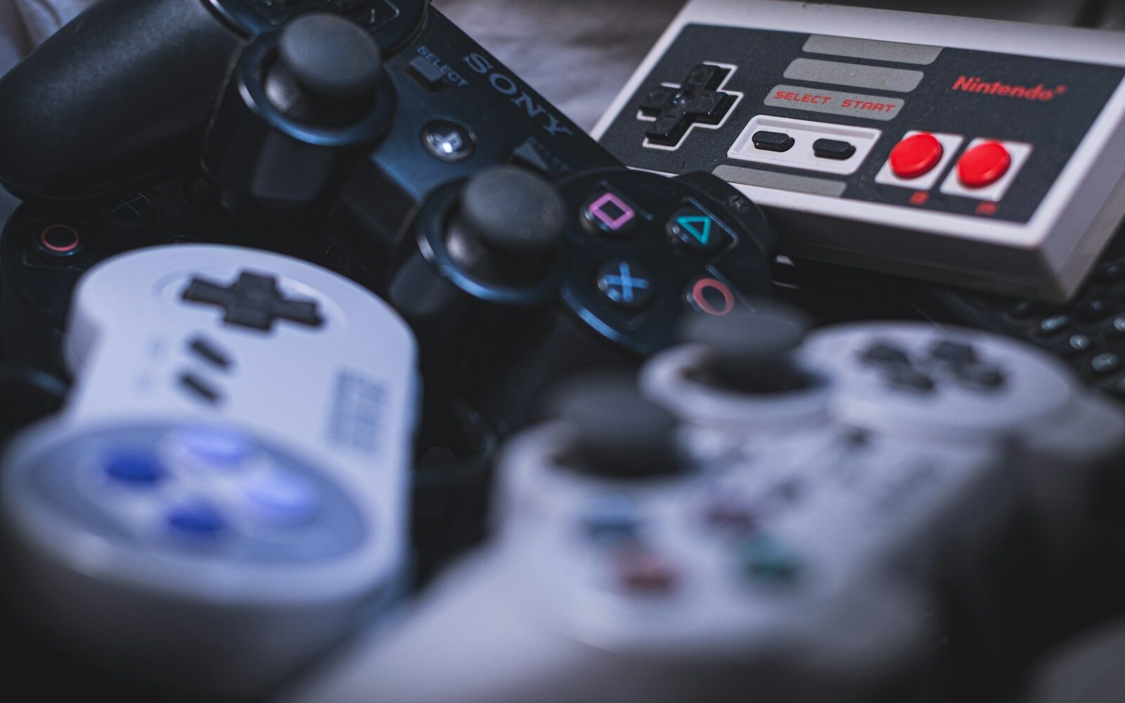
You could identify some early-2000s game systems before the menu had finished loading.
The sound, motion, colour, depth and slightly mysterious geometry told you where you were. The interface was not a neutral layer sitting on top of the machine. It was part of the machine’s personality.
The console menu was a place
Modern interfaces are very good at teaching us how to use them. Repeated patterns reduce confusion. Cards look like cards. Settings live where settings live. That consistency is useful.
But it also means many interfaces feel interchangeable. The PS2/Dreamcast era was much more willing to make the operating environment strange.
Startup screens felt like events
Turning on a console involved anticipation. The startup animation, sound design and transition into the game created a tiny ritual. The machine announced itself.
Menus had texture
Interfaces used space, glow, transparency, rotating objects, abstract backgrounds and custom sound in ways that would probably make a current design-system team nervous.
Some of those choices were inefficient. They also made the product memorable.
Save systems became visual objects
Memory cards and save icons gave abstract data a physical feeling. You could see the limits, understand that storage was finite and sometimes develop irrational emotional attachment to a tiny icon representing dozens of hours of your life.
Games copied the confidence
Many games from the period treated menus as part of the art direction. Horror interfaces could be unsettling. Racing menus could look like broadcast graphics. RPG interfaces could feel ceremonial. The menu was allowed to continue the fantasy.
What changed?
Games became services. Platforms became ecosystems. Accessibility expectations improved. Digital storefronts, accounts, subscriptions and cross-platform patterns created reasons to standardize.
Those are real improvements. The tradeoff is that interface personality increasingly has to survive inside systems optimized for consistency.
The lesson is not “make menus harder”
The lesson is that usability and identity do not have to cancel each other out. A clear system can still have sound, motion, typography and interaction that belong to the world it represents.
PS2-era menus were cooler because they behaved like somebody cared what it felt like to be there.
We aim to use primary sources, firsthand testing and clearly attributed expertise wherever possible. See our editorial policy.
Keep going